Rebuilding the Bake.io Website Under Real Constraints
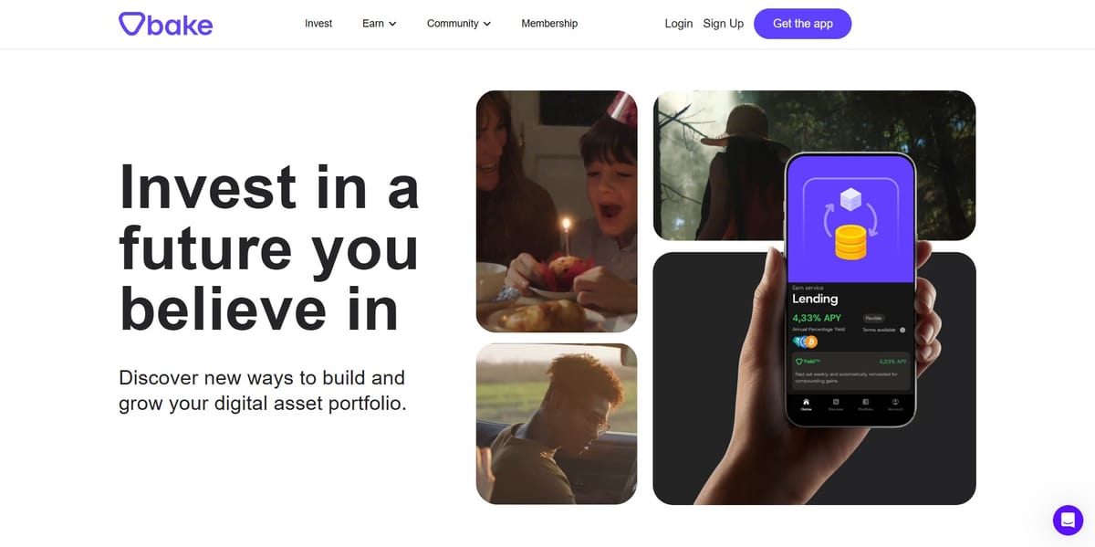
When Bake.io went through a rebrand, the website had to change with it. Not eventually. Not after “alignment”. It needed to be live in a few weeks.
I was leading the frontend development for this rebuild. On paper, it was a static marketing site. In reality, it was a constant balancing act between speed, visuals, SEO, and people with very different priorities.
The hardest part wasn’t writing code. It was deciding what not to build, early enough to keep everything fast, clean, and shippable.
What We Were Actually Trying to Achieve
The goal was simple to say and harder to execute:
- A public-facing website that reflected the new brand properly
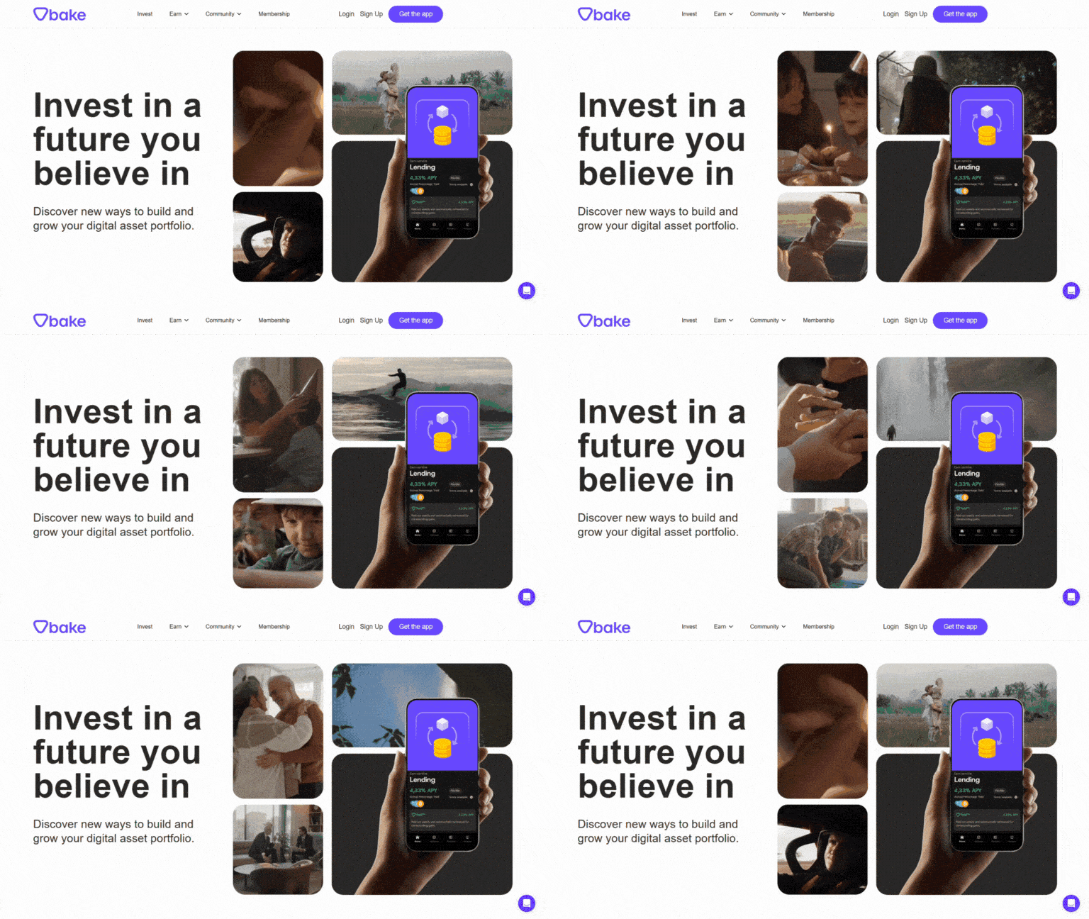
- Strong visuals and animations without feeling heavy
- Excellent SEO from day one
- A site that stayed fast on both desktop and mobile
- Minimal long-term maintenance overhead
Marketing wanted flexibility. Design wanted expressive visuals. From an engineering perspective, I wanted the site to be boring in the right ways. Mostly static, predictable, and hard to accidentally break.
Constraints That Shaped Every Decision
A few things mattered more than everything else:
- The timeline was tight enough that rework would hurt badly
- SEO was not optional
- There was an above-the-fold video, which is usually a performance trap
- Some dynamic data was still required for crypto pricing
- Multiple stakeholders meant constant alignment was unavoidable
This meant every animation, dependency, and interaction had to justify its existence.
Choosing the Stack
I compared a few frontend approaches early and landed on Gatsby.
Not because it was exciting, but because it gave me what I cared about:
- Static generation by default
- Strong SEO characteristics
- Built-in image optimisation
- Predictable performance if used carefully
I wanted a framework that would push back when we tried to do something unnecessarily expensive.
Bringing in a CMS Without Breaking Performance
We used Prismic as the headless CMS so marketing could manage content without engineering involvement for every small change.
The key requirement was that content flexibility could not come at the cost of performance.
The integration worked like this:
- Prismic acted purely as a content source
- Gatsby pulled content via GraphQL at build time
- Pages were built statically, not rendered at runtime
- Flexible layouts were handled using Prismic slices, mapped cleanly to reusable React components
Marketing got freedom. The site stayed static and fast. Nobody had to fight about it.
Build Configuration & Content Publishing
Because content lived in Prismic, the build pipeline had to be reliable.
The setup included:
- Environment-based configuration for Prismic repo and access tokens
- Build-time content fetching only
- Webhooks from Prismic to trigger rebuilds on publish
- Build caching tuned to keep deployments fast
From a workflow perspective, this meant: edit content → publish → rebuild → live, without engineers being pulled in to fix text changes.
Dynamic Product Pages Without Manual Routing
One of the main advantages of Gatsby here was programmatic page creation.
Product pages were not hardcoded:
- Each product lived as an entry in Prismic
- During the build, Gatsby queried all product documents
- Pages were generated dynamically using product slugs
- Each page used a shared template, populated via build-time queries
This allowed the product section to scale naturally. Marketing could add or update products in Prismic, and Gatsby would generate the correct pages automatically on rebuild.
No manual routing. No duplicated templates. No fragile glue code.
Working With Design Without Destroying Performance
Designs were animation-heavy, which was fine in principle. Some early concepts, however, would have significantly impacted load times.
Rather than implementing everything blindly, I worked closely with the design team to:
- Reduce animation scope where it didn’t add real value
- Replace heavy JavaScript effects with lighter CSS-based alternatives
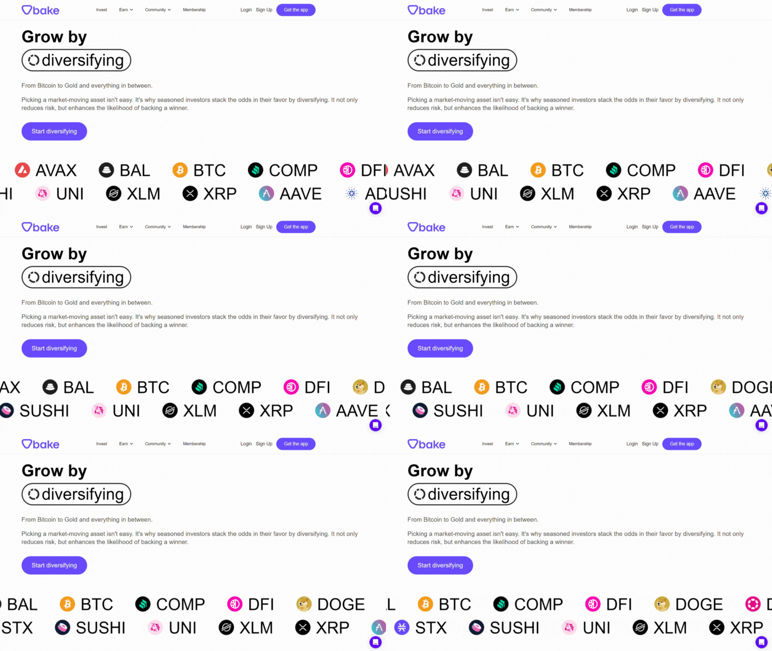
- Simplify visuals above the fold
- Propose technically cheaper ideas that still looked good
This wasn’t about cutting corners. It was about keeping the site fast and polished, without paying unnecessary performance costs.
Performance Targets (Set Early, Enforced Often)
I didn’t want performance to become a last-minute argument, so I set clear targets early:
- Lighthouse SEO: 100%
- Lighthouse Performance: 90%+ on both desktop and mobile
Those numbers weren’t aspirational. They were constraints.
To hit them, I was strict about:
- Using Gatsby’s image optimisation pipeline instead of raw assets
- Lazy loading images and media by default
- Keeping third-party dependencies to a minimum
- Rendering everything statically unless there was a strong reason not to
- Being careful with how above-the-fold content loaded, especially the homepage video
- Limiting API calls strictly to dynamic crypto pricing data
Lighthouse scores were checked continuously during development, not at the end.
Interactive Elements Without Bloat
The site wasn’t purely static. It included interactive elements such as calculators.
These were:
- Lightweight
- Dependency-light
- Built to work cleanly within a mostly static architecture
Interactivity was added intentionally, not as an excuse to ship unnecessary JavaScript.
Coordinating With DevOps
I also worked closely with DevOps to set up the build and deployment pipelines.
Because this was a static site, reliability and build speed mattered more than runtime complexity. The focus was on predictable builds, fast deployments, and avoiding surprises when content changed.
What Went Well
- The site launched within the required timeline
- We hit the Lighthouse performance and SEO targets
- The design stayed pixel-perfect to Figma while remaining performant
- The codebase remained clean and maintainable
- There was very little late-stage panic
That last point matters more than most people admit.
What I’d Improve Next
If I were extending this further:
- Add automated performance regression checks in CI
- Improve tooling for faster marketing-led content updates
- Continue optimising build times as content grows
Why This Project Matters to Me
This project wasn’t about flashy frontend tricks. It was about judgment.
Knowing when to say yes, when to simplify, and when to push back early is often more important than writing clever code. Shipping something that looks good, loads fast, and aligns multiple teams under pressure is the real work.
This project reinforced that frontend engineering, done properly, is as much about decision-making as it is about implementation.
Tech Stack
Gatsby, React, JavaScript, SCSS, Prismic CMS, REST APIs, CI/CD

